


 is for DESIGN. Let’s give it full caps just because it’s December.
I’ll clue you in — what follows is Design through a wide-angle lens. Social environs, stage action, education, creative thinking. The same guidelines serve for more predictable projects, like a super-clean website or the perfect can opener, but let’s indulge in the more high-flying work in C-U.

Seminal thinker and design eminence, Walter Gropius wrote in his 1919 Bauhaus Manifesto that design is the inspiration behind any object which is an instrument for improving social life and bringing order, reason, and expressive vitality to everyday experience. Sound like a good idea? Design is also something you yourself devise daily whether you think about it or not, from the vehicle you choose to get across town to the way you spend a Friday evening.
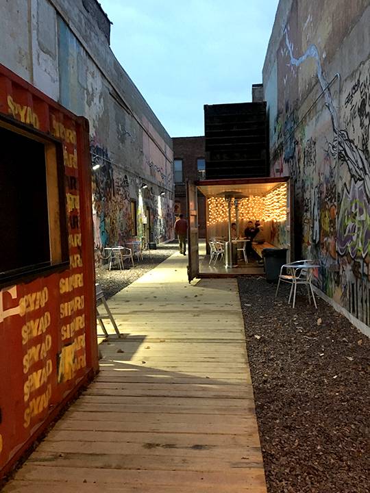 Let’s start in that intriguing alleyway in downtown Urbana, Sipyard, a beer garden with flair. Who cares if it’s cold? Walk into the open space between [co][lab] and C4A for an hour in heated but exhilarating outdoor ambience.
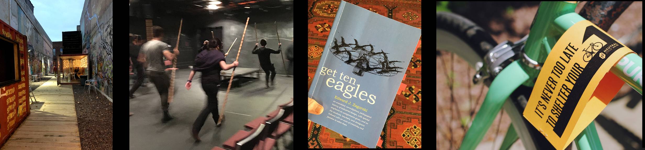
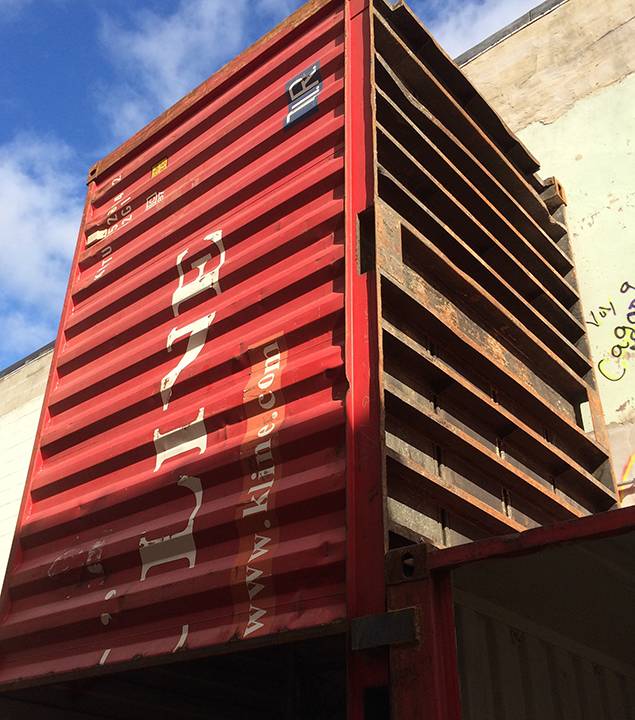
Four recycled shipping containers perch in a narrow space on Main Street just west of Race. They’re adapted for a bar counter and seating with twinkling lights, outdoor heaters and offerings from Triptych Brewing in Savoy. Put on your favorite hat and mittens and join Matt Cho, Carl Catedral, and Jarvis Kim who will cheerfully host on weekends until it gets just too darn polar. They’ll be there the next two weekends to share the space with a pop-up holiday market.
 Two of the containers are available for lease — have any ideas? One is square like the bar, perfect for popup business. And that vertical container reaching skyward would make a dandy recording studio for on-the-fly podcasts. The possibilities are as vast as Cho’s inventiveness in developing creative spaces in underused brick buildings on Main and Race streets.
What Sipyard incorporates of skillful design: Simplicity. A certain kind of elegance. Efficiency. Affordability. Adaptability. Comfort. Whimsy. Appeal. With a bit of steampunk thrown in. And perhaps the biggest factor is how it arose from constraints, a key element of design. Total freedom too often results in self-indulgent chaos. Cho’s had a narrow space, rigid confines, and wanted to carry out a central intent: to create spaces where people will interact and be inspired.
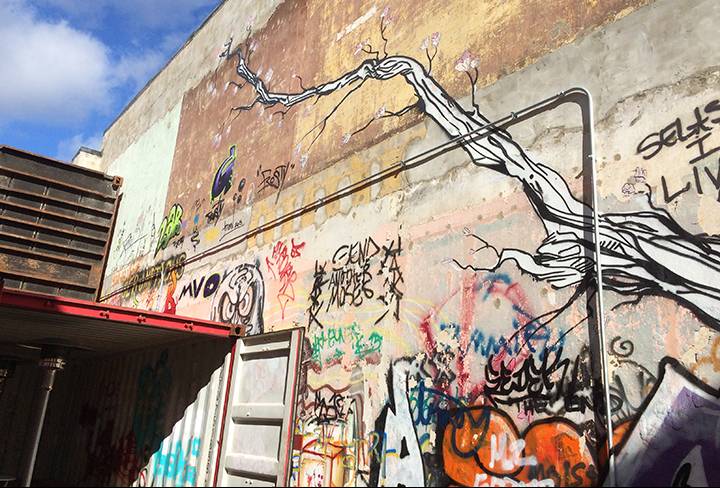
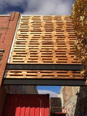 The aesthetics Cho describes as hard / soft. Tall brick walls, gravel, and the contrast of a wooden walkway and benches by Norden, made of cedar surplus from Cho’s new façade. The original brick front couldn’t make it structurally so Cho designed an intricate front that both invites in maximum light and connects with the neighbors — perfect for those holiday lights all down Main Street. He softened the steep walls with faux trees painted by muralist Langston Allston, who threw in a few zombies just for good measure.
Sipyard is a happy happenstance of Cho’s first downtown ventures, Cafeteria & Co. and [co][lab]; you can check out the back story here. But the narrow building to the west was a problem. Leaking was a danger to [co][lab], so Cho bought it to protect his working space. Too expensive to renovate, he tore it down.
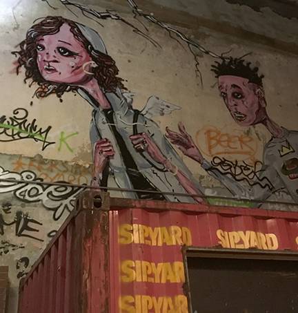
That produced an awkward open space. An idea Cho enjoyed in Asia and Austin was shipping containers brought into public space to make enclosures for shops and bars. He’d visited beer gardens made that way. After some brainstorming with his partners, they ordered four recycled receptacles from K Line Shipping in Oakland, California.  You can sit with a Triptych 204 Punky Town Brown and envision days on the high seas. Enjoy that crenelated red surface, original labeling intact, with artful stenciling for the latest incarnation.
![]() Cho is a master of the lean start-up, with keen business instincts for trying things out and tweaking as needed before it takes big money. Raised in town, he acquired degrees in architecture, urban planning, information systems, civil and bio engineering. He puts them all to good use for our enjoyment; we’re lucky he came back to town with energy and ideas.
Cho is a master of the lean start-up, with keen business instincts for trying things out and tweaking as needed before it takes big money. Raised in town, he acquired degrees in architecture, urban planning, information systems, civil and bio engineering. He puts them all to good use for our enjoyment; we’re lucky he came back to town with energy and ideas.
 While we’re admiring creativity in three dimensions, let’s roll in some movement and story. The wealth of live theatre is a treasure in C-U. With so much of our contact across cyberspace, take advantage of in-person drama; when you sit with an audience, you are part of the performance. Laugh together, gasp together, soak in a little body warmth and people-watching.
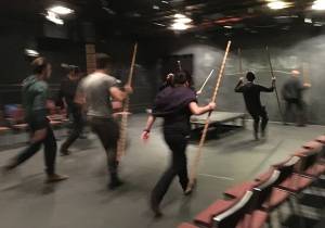
Theatre students at the U of I are fully immersed, in studio for 4 hours on weekday mornings with four more of rehearsal, and an extra stretch on weekends. It’s no small commitment. What they work with is the Human Story. And as we know all too well, violence is often an element.
Staging conflict is an art. It can’t be too realistic; everyone needs to walk away in one piece and do it again the next night. And the costume needs to ride again, clean and pressed.
We have one of the country’s sought-after “fight directors,” Robin McFarquhar, chair of the acting program. He started in acrobatics growing up in England, came to the U of I for sports psychology and kinesiology program. From there the stage called.
 McFarquhar works with the script, the director and actors to design the moves that will best tell the story. He doesn’t sweeten his subject. It is violence, and he knows how to make it safe, elegant, convincing, and fresh each night for the run of the performance. His work with students is to teach the art of theatre: essentially storytelling. Mercutio and Tybalt’s fatal swordplay in Romeo and Juliet? A slap and stagger in Streetcar Named Desire? Gang warfare in A Clockwork Orange? McFarquhar has staged these and much more in theatres across the country.
The current MFA production is a one-hour adaptation of Shakespeare’s Henry V. There are no battle scenes in the script, but some adrenalin deepens the action. The chorus asks “Can this cockpit hold / The vasty fields of France?” McFarquhar and director Bob Anderson found the way. A beautiful progression of stylized battle scenes brings fire to the Hundred Years War and the gorgeous language. With wooden staffs, the troupe convinces with sweeping moves, thundering thuds, and thrilling thrusts and falls.
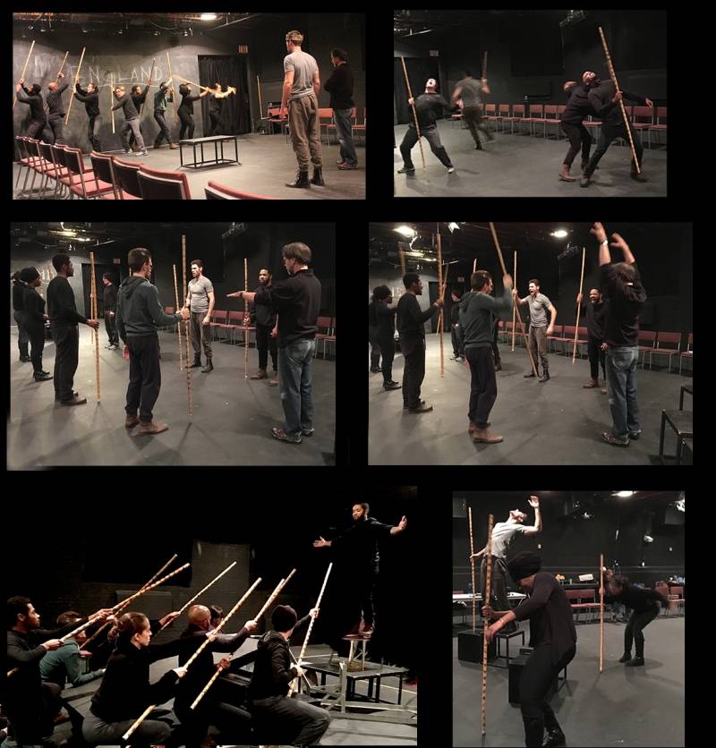
McFarquhar’s aim is always to “tell the damn story.” Don’t repel the audience with too much gore. Deliver the right kind of blood for the right effect, and be sure it’s dark enough to look red under stage lights. Plan punches and falls with direct and simple moves. A staged fight has to be different from real life to look like we think it should.
The design must accommodate the skills and limitations of the actors, as well as their costumes. Don’t endanger Juliet’s delicate dress with too much ecstasy or lamentation. McFarquhar has designed 19 productions of Romeo and Juliet, each its own, designed for a particular setting, staging, actors, and director.
He is a designer but a dedicated teacher. Students must be taught to carry their character’s full personality into and out of a fight. They learn that no one simply “exits” the stage — they flounce, flee, trudge, or stride with purpose to the next room. It’s a different kind of work when he designs for seasoned actors, as he has with John Malkovich and Denzel Washington.
What are the design principles at work in a staged fight? Add the dimensions of time and space. In elegance and economy, an actor must move in character from one side of the stage to the other. Look for rhythm, pace and timing. As always, simplicity is best. High art involves economy: of movement, rehearsal time, emotion, physical contact. Balance. Variety. Unity.
Remember that stage actors don’t get stunt doubles. No special effects or fancy camera angles. The constraints on a set are in a world different from film, but sweat and tears ten feet away can move you unlike what you watch with popcorn in a sticky cinema complex.
Take your sturm and drang to a live performance in town and you may find your heart pounding along with the actors.
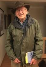
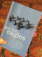 For classroom wisdom in the practice of design, there’s no better than Get Ten Eagles, reflections on forty years of Industrial Design from emeritus Prof. Ed Zagorski. He tells in gripping detail the delights of classroom challenges and conundrums, with much creative wisdom tucked in. Many of his students are well-known professionals.
Zagorski is the originator of the “egg drop,” inspired by his class in 1962 as they watched John Glenn lift off, the first American in space. They longed to grapple with what g-force does to a human body through liftoff and splash down. Zagorski knows that if the stakes are too big, creative thinking freezes. So for a class assignment, he replaced the living astronaut with a raw egg.
Here’s the brief: package an egg to survive intact: first, propulsion 200 feet in the air; and last, safe landing in the reflecting pool at Art + Design on Peabody. The show-stopping solution sported a firecracker; a flurry of American flags released at the top of the arc; a parachute wafting the encapsulated egg gently into the water; a dissolving aspirin and a motor to nudge the egg back to the hands of its launcher. Elegant and dramatic. The genius of this project made it to Life Magazine in 1963, and it’s been copied all across the world. If you have a free afternoon, give it a try.
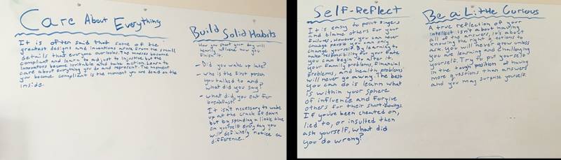
Key in Zagorski’s classroom: good design requires a creative environment. “Good designers never grow up; they always seem to think like children. That’s because the child in us makes us creative, allows us to see things with a sense of wonder.” And so his classroom has been first and foremost a rich playground. He laments today’s headsets and messaging; they cut students off from the most valuable part of education. He prefers the rich interplay of ideas and serendipity when all senses are engaged in a shared task.
Zagorski considers creative thinking to be a life force. And he includes the entire human body in the equation: the failure of a designer to use all of his senses in designing a product is a block to creativity. The teacher must provide the freedom to break rules. Guidelines for creative work:
The three “creative prods” … should be part of every design teacher’s repertory. Create a classroom environment that permits a free-wheeling, problem-solving approach; instill in each student a creative, positive outlook with a commitment to playfulness and unfettered experimentation which can often engender passion; and provide the creative stimuli, exposure to a broad range of information and experience, and a habit of looking at things from surprising angles.
Another project: in one hour agree on dimensions for The Perfect Chair. Recipe? Divide a class into groups of all different body sizes, shapes, and sexes. Provide an ample stack of lumber and props like wastebaskets or the odd cinder block. Each group must reach consensus on the ideal height and shape, emerging with a drawing on brown paper made only with chalk and string. Consider backrest height, width and depth as well as pitch. No rulers allowed, or reference to industry standards for proportions.
Cap it with an encore: two hours to create a model with no power tools permitted. In the room are hand saws, nails, and scrap lumber from old packing crates. “Simply but accurately express the dimensions that you have determined ideal, and build the chair strong enough so that others may sit upon it to determine its fitness.” Imagine the creative furor in that fortunate classroom. Wouldn’t it be fun to try out the results.
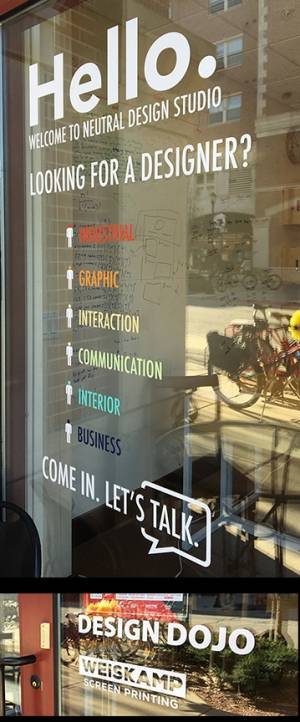
Let’s finish with a leap into Pure Design, emerging out of a studio in Urbana. A quiet doorway on South Gregory between Illinois and Oregon invites you into its design dojo. Your mission, should you choose to accept it, is to leave ego outside. Accept that you know nothing as you enter. And prepare to engage beginner’s mind with the many-talented collaborators of Neutral Design Studio.
A founding member, Tim Chao graduated with a degree in physics. Yes, it’s cool to understand the laws of the universe, but he’s more interested in the workings of society. The guiding principle behind each problem Neutral takes on is to care about people.
Chao uses a physicist’s eye to solve problems, knowing that simplicity is more likely when feelings are removed from the equation. The studio emerged from Chao’s trajectory of life and business in Urbana, beginning with bicycles. He sees the bicycle as an art form.
That inspired Neutral Cycle, first housed in the garage behind his cooperative house on Stoughton Street. City staff objected to commerce on a residential street and vetoed the hand painted post for “Free Air.” Neighborhood support won out, the business flourished, and Chao made it his business to become partners with the city. He has faith in the power of government to serve community needs, collaborating with Urbana’s Economic Development Manager Brandon Boys to offer incentives for smaller startups. Some are in action at both Neutral Design and [co][lab].
Chao tends to incubate businesses and move on to new ventures. Neutral Cycle, with new leadership, now occupies an elegant space on Fifth Street just north of Green. Neutral Design Studio is a natural progression. And here Chao has returned to his aspirations for designing a better world through each task.
Their philosophy of design? In its projects, Neutral Design aspires to encompass the essentials of what makes an effective society. Food, clothing, housing, transportation, education, entertainment, health care, government.
Any new member of Neutral Design Studio gets a bicycle with the charge to take good care of it. Then spin those wheels around town and experience up close what makes C-U tick. Where is business? What is needed? Where are amenities concentrated? What main streets aren’t bike-friendly? What’s the best café for bikers? Chao is also concerned about the bigger picture, including the split between campus and community, and growing disparities in privilege.
The design dojo is first and foremost a place to learn, from both nature and human nature. At base, we’re all hungry. How we satisfy that hunger — physical, emotional, spiritual, economic — determines the quality of everyday life. At Chao’s Stoughton Street home he emphasizes growing and preparing good food together. On alternate Sunday nights the house is open for a community meal.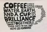
Young people come into the studio with exciting ideas but little experience in dealing with business realities like client relationships, how to manage tasks and people, working through conflicts. It’s the careful attention required at each step that can bring a good design into fruition. And it’s about Fun.
The art of coffee is important to Neutral Design. Better yet, combine biking and coffee. They’ve designed a sleek silver cup holder for your handlebars. Chao took nine studio members on a road trip to meet a master of community and coffee, T. J. Fairchild, whose Commonplace Coffee has spawned 35 cafes in Pennsylvania. His mission: “The Commonplace exists to build community, to enhance the craft of coffee, to provide support to other cafe owners, and to provide an excellent workplace.” Simple but profound. And soon to be embodied in Neutral’s undertaking-in-the-works, Speedwagon. Here’s co-founder Ricardo Pierre-Louis with the plan for their part of 129 North Race Street, another collaborative project with Matt Cho.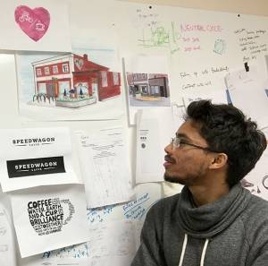
Neutral Design has many local clients. They designed the ChambanaBike rental system that gives students affordable access to good wheels, and a product for a Research Park startup, Intelliwheels, that changes the gear ratio on wheelchairs to 2:1 so they are dramatically easier to push. Original thinking, creative surroundings, and young talent make for exciting innovation. 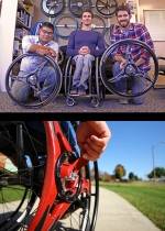
Design: a life force worth your attention. Hang out with local visionaries. You may find yourself on an adventure: journey through space and time at live theatre; fly free with your sweetie on a Big Yellow Tandem; sip hot spiced wine outdoors at night.
Follow Steve Jobs and Stay Hungry, Stay Foolish. I can’t think of a better place to do that than our perch on the prairie.
—————————————————————————————————————————
And what about D? From left to right: the original root may be the Egyptian word for door. The Phoenician daleth moves toward our “D”. The Greeks added a leftward flip to their delta which inspired our lowercase. The Etruscans refined the shape, and the Romans flipped it ever so beautifully. Back to typography with the Trajan column:
Cope Cumpston is resident book designer, typographer, and community enthusiast. The archive for Abecedarian Amble lives here.