


I am foregoing writing about a bathroom and an emotion this month in order to report on a terrifying trend that I see happening in Champaign. As I’m sure you’ve noticed, unless you’re one of the many blind hermits that live in Savoy, a ton of huge, grey, and very angular apartment buildings have been built and are continuing to be built in and around Campus. If we do not stop this fell tide, all of Chambana may soon be engulfed. I have taken it upon myself to catalog the leaders of this invasion and document their many aesthetic offenses.
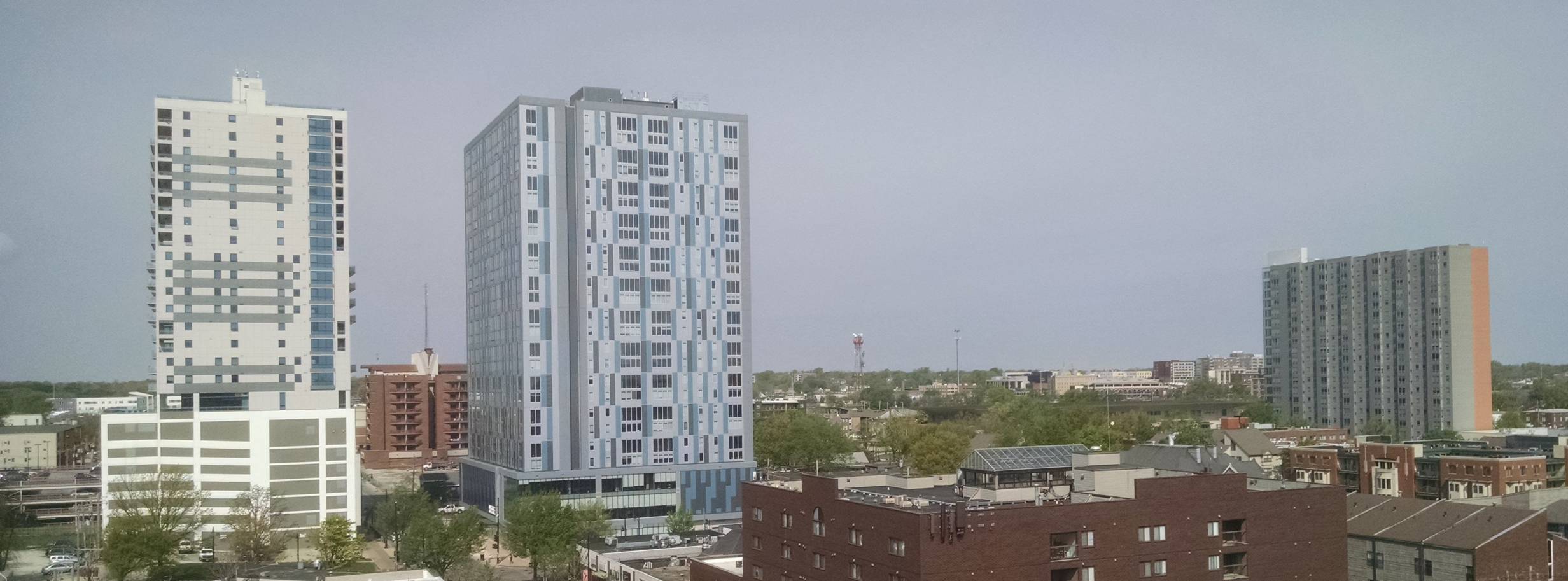
Let’s start things off by talking about the Drab Duo; the two preposterously large apartment buildings on Green between 3rd and 4th. These guys embody all of the worst aspects of this latest building trend. They are huge, composed completely of right angles (not a single curve in sight), and they are shades of grey with blue trim. This last aspect constitutes a disturbing trend in itself. Almost all of the new buildings around campus are grey and blue. It’s as if every design discussion went like this:
Campus Slumlord #1: “We need our new building to appeal to the students so we can take their money. What color should it be? What do the students like?”
Campus Slumlord #2: “The only thing kids like these days is Facebook, we should make our building GREY WITH BITS OF BLUE to be like Facebook.”
Campus Slumlord #1: “GENIUS! Those dumb kids won’t be able to tell the difference between where they live and the website where they spend most of their time.”
*and then they high five*
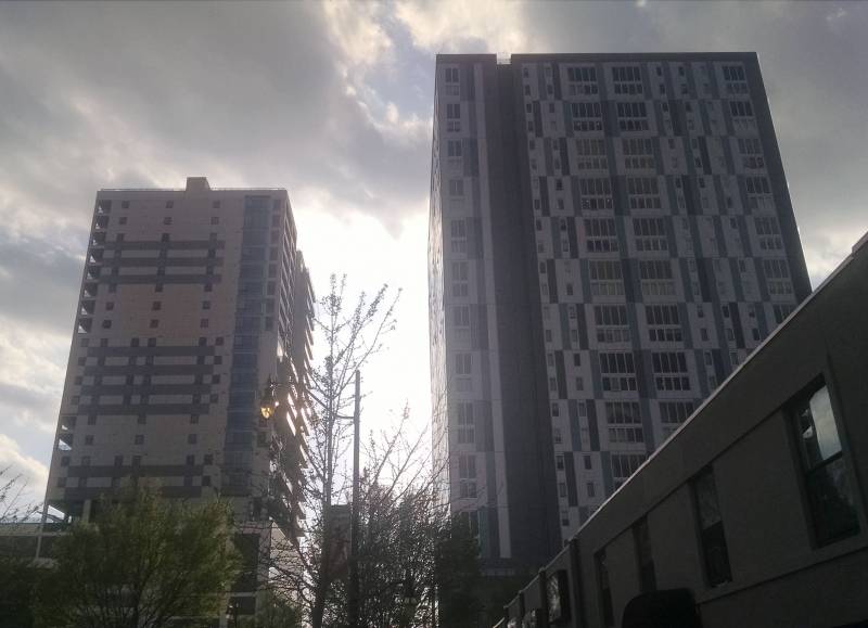
Apart from being dull monstrosities, I hate the Drab Duo because they block afternoon sunlight along all of Green Street, and they also create an annoying wind tunnel effect just along that block. Now let’s get into why I dislike each of these buildings individually.
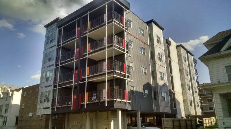
309 Green
This is the bigass apartment building on the South side of Green Street (not to be confused with the other one, which I’ll get to in a minute). Having opened in 2008, 309 Green was part of the first wave of huge grey abominations. The most interesting thing about 309 Green is that students nicknamed it “The Whopper.” This was partly because of its preposterous size (it’s still the tallest building in Champaign I believe, beating out its counterpart by one foot), but also because a poor innocent Burger King was bulldozed to make room for it. I’m not sure if anyone still calls 309 Green “The Whopper,” but they ought to.
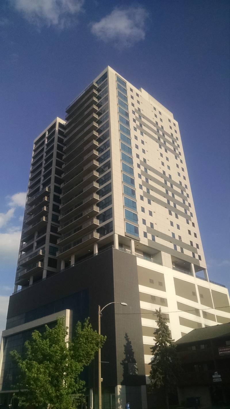
“The Whopper” is pretty bland, but just look at how many balconies it has! I’m a sucker for balconies and the danger and romance they connote. One day I hope to have a balcony of my very own. So I’ll admit that part of my disdain for “The Whopper” is just balcony envy.
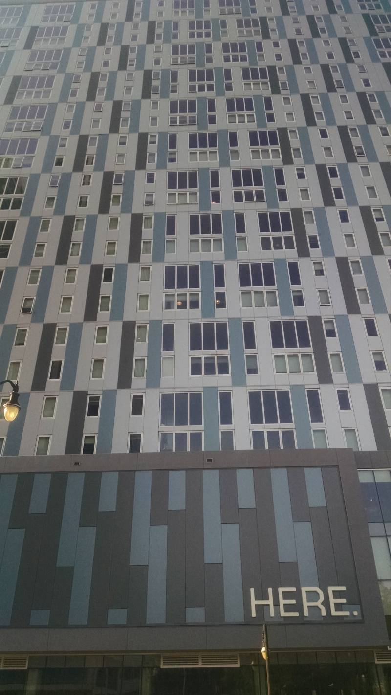
HERE.
Yes, this building is actually called “HERE.” The period is part of the name. If the building was named HERE. just to confuse and anger stoned people, I could maybe respect it, but the name appears to be an attempt at cleverness. The place’s website says things like “IT ALL STARTS HERE.” and “DO MORE HERE.” and most ridiculously “DEFINE YOUR FUTURE HERE.”
This is how the creators of HERE. hope that conversations about it will sound:
Party Dude: “So, where do you live?”
Party Chick: “HERE.”
Party Dude: “Whaaaaat??? Here in this frat house???!??????”
Party Chick: “No silly, HERE. It’s Champaign’s newest luxury apartment community!”
How these conversations actually go:
Party Dude: “So where do you live?”
Party Chick: “One of the big buildings on Green.”
Party Dude: “Which one?”
Party Chick: “It doesn’t fucking matter.”
Party Dude: “Amen.”
Ugh, I thought this place was just mildly silly, but now that I actually have to write HERE. and use it in real sentences, I’m starting to really hate it. I think we can give it a better name. Just imagine answering the question “where do you live” with each of these responses:
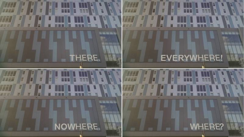
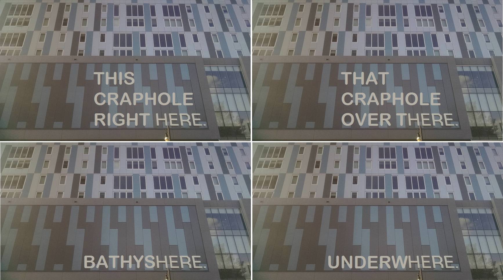
Obviously there are all good options. BATHYSPHERE is particularly whimsical, and WHERE? is even better than HERE. if you’re into Abbott and Costello style comedy bits, but UNDERWHERE. is the one that makes me giggle the most, so obviously that’s what I’ll call it for the rest of the article and the rest of all time.
What else is terrible about UNDERWHERE.? Well, on their website, one of the “Amenities” listed is “Chicago Styled exposed concrete.” That seemed like a scam so I did a Google search on it. Tellingly, the first hit is this Wikipedia page for one of the world’s least popular architecture styles. Kids, don’t pay extra money for a builder’s laziness.
Finally, I will always hate UNDERWHERE. for destroying the IHOP on Green. I know people who went to UIUC in the 80s and they’d always say that everything had changed since then except Murphy’s and the IHOP. It was a magical place where you could go and get pancakes literally any hour of the day. The IHOP was cruelly killed to make room for this eyesore and now I hope that the residents of UNDERWHERE. are constantly haunted by the smell of fresh pancakes and bacon that they can never eat.
Oh right, I haven’t even talked about how this place looks yet. It’s huge. It’s flat. It’s very grey and very blue and I hate it.
Burnham310 (the one by the County Market)
If you were not aware, the big building next to the County Market on Springfield is called Burnham310. Yeah, there’s no space there between “Burnham” and “310,” it’s just Burnham310. I of course, being a denizen of the Internet for many years, convert this into leetspeak where it reads as “BURNHAMELO.” Which is great, and fun to yell.
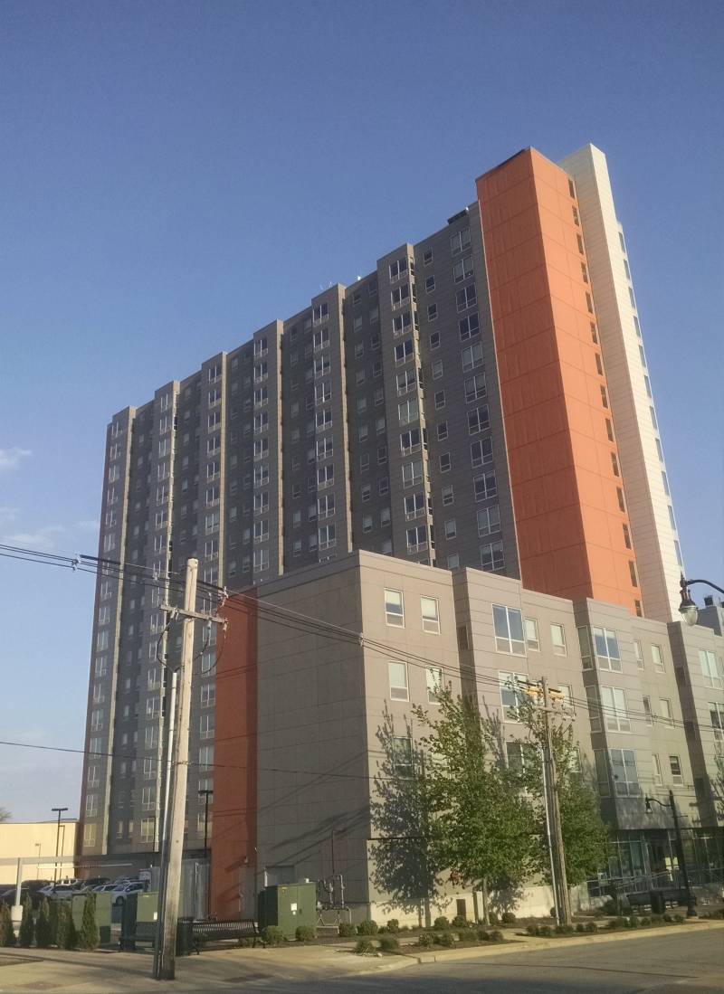
BURNHAMELOOOOOOOOH was finished the same year as “The Whopper”, but I gotta say, I don’t hate it nearly as much as the Drab Duo. Maybe it’s because Burnhamelo has the decency to not be right on Green Street. Maybe it’s because it’s a “modest” 18-stories tall, or the fact that it has a Wikipedia page which makes it feel super special. Don’t you want to live in a building that has its own Wikipedia page? Likely the main reason I don’t hate Burnhamelo is that its accent color is a warm, friendly orange/salmon instead of cold, emotionless blues.
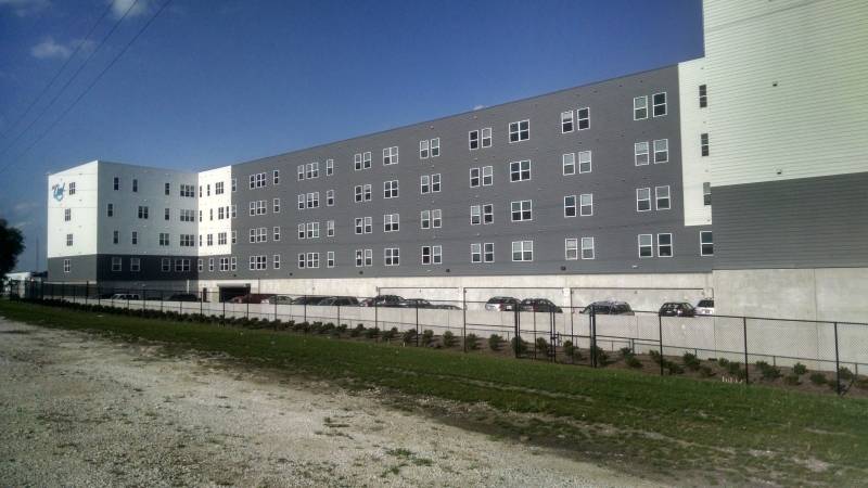
West Quad Apartments (on Green by the railroad tracks)
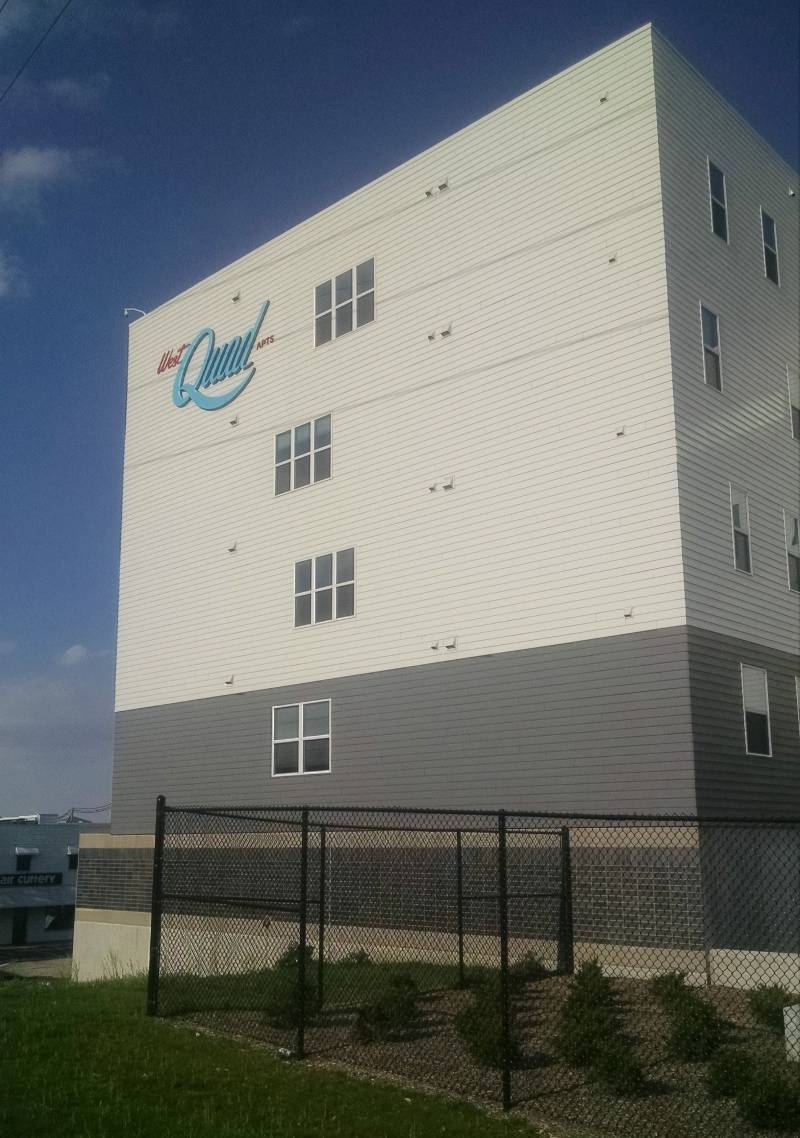
If the Soviets back in the Cold War had created a Party Gulag (a compound where political prisoners were forced to wear tank tops, do keg stands, and dance until they died of exhaustion), it would have looked something like the West Quad Apartments.
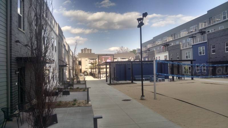
When I walked by this place, nobody was playing beach volleyball, romping in the pool, or watching stuff on the enormous screen at the end of the courtyard. But can’t you just picture a world, where as the sun comes up, klaxons sound and legions of tired people stumble out of their lifeless grey domiciles and into party positions as merciless men with bullhorns stand atop each roof yelling with a heavy accent: “PARTY HARDER, PARTY FOR THE MOTHERLAND!”
I could not stop taking pictures of this place. Just look at how lonely it seems.
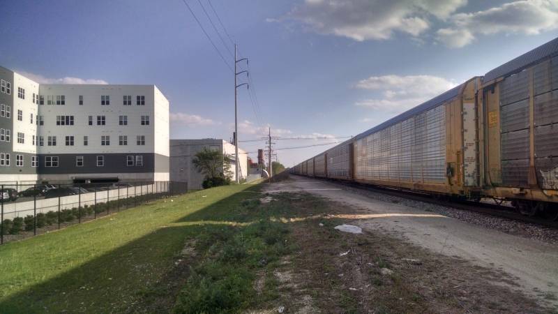
If freight cars have more character than your apartment building, you may have a problem.
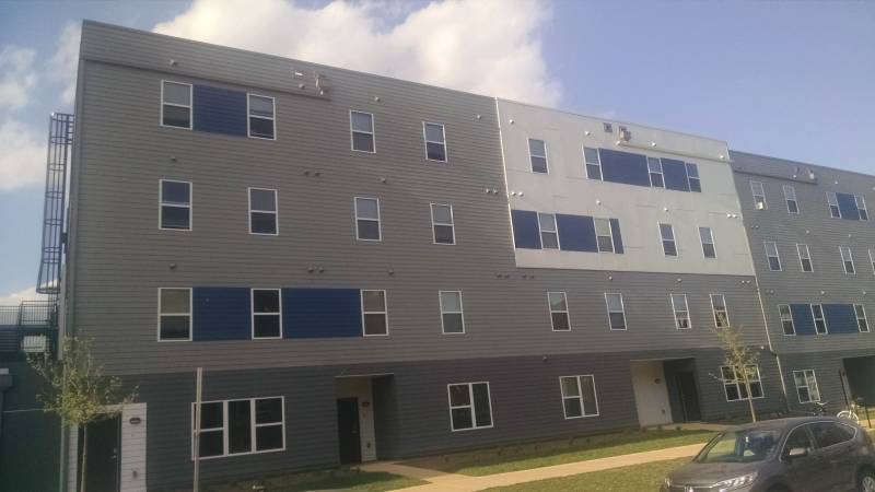
“Hey Fred, we only got a little bit of this blue siding. Where should we put it?” “Eh, just stick it in randomly. It’ll give the place ‘character.'”
All in all, West Quad Apartments look terrible, but at least they aren’t that tall.
1st Street thingy
This building on 1st Street just North of Green isn’t even done yet, but it is already part of the relentless fugly grey horde (with blue accents of course).
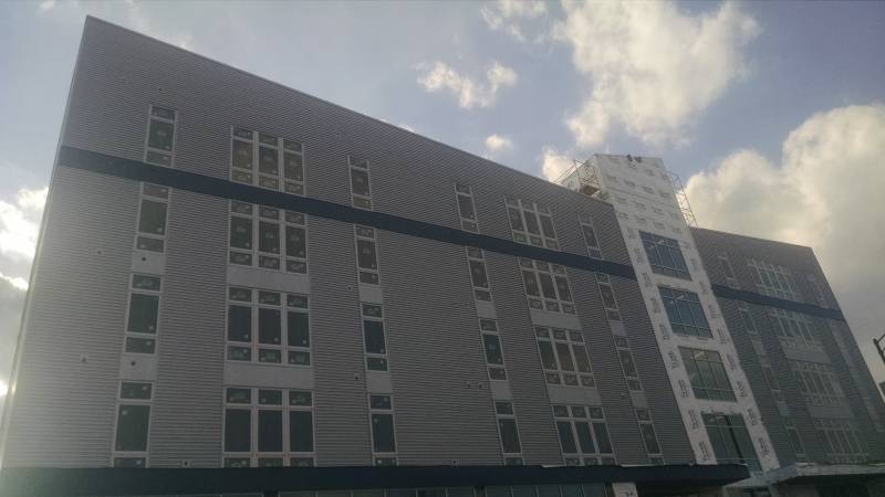
Look up there though! The top of the facade slopes downward at non-right angles! Innovation! Character! Whimsy!!!
Alas, this bold choice is not continued on the back side. Probably for the best though. Wouldn’t want to be TOO innovative.
??????????
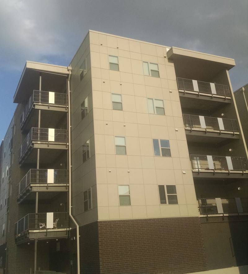
I don’t even remember where this building is or if it has a name. At some point I just started taking pictures of any big grey boxes I saw. This one doesn’t even have blue highlights, which maybe makes it edgy and cool? Nope. Just boring.
Now let’s end this massive column with two building I actually kinda like.
309 E. John Luxe Rentals
Sure, this place is super square and super grey, but look! Red accents with orange mini accents! Vaguely stylish! Also, while most of the other buildings on this list seem designed to look aggressively inoffensive, 309 E. John Luxe Rentals (yes, that seems to be its full name) has a look that is consciously industrial and actually sorta cool.
Side note: The description for this building mentions “kegerators in some units” (I’m such an ancient prude I had to Google what a kegerator is). Now, I’m not one to start spouting off “back in my day” stories, but damn. Back in my day a luxury apartment would list stuff like “windows included in rent,” “mostly squirrel free,” and “real walls.” Now students can get a place with a washer and dryer in unit and a separate fridge for their kegs!? That’s just crazy.
303 S. Fifth Street (MHM building)
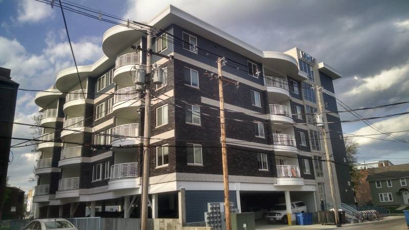
A diamond in the rough. A brand new building that is blue/grey and not totally boring. Years from now, when the fugly grey rectangles have taken over and destroyed every other building in Champaign county, we will take our children to the MHM building to show them how things used to be. We’ll point out the nice curved balconies, grandfathered in even though curves where outlawed in 2027. And we’ll have them touch the brickwork and say, “everything in town used to be made out of this. Those were happier times.”
Was there a big bland building that you think I missed? Let me know in the comments.