


 is for typography. It’s a good cold-weather exploration — the pleasure of letters is everywhere, indoors and out.
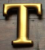
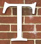
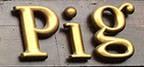 You can catch this monumental T from the car window as you pass The Blind Pig in downtown Champaign. It’s a solid, respectable typeface, nicely done in three dimensions — although that little “g” just didn’t want to line up right:
It’s true that letters are everywhere, more often than not an unfortunate mashup. I’ve often lamented that C-U doesn’t offer much stylish signage. But I’ve never fallen out of love with the possibilities.
When you look carefully, there’s a universe of letters out there with fascinating stories, some beautiful and some not-so-very, and they’re great fun to critique. Let’s take a spin around town.
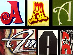
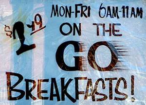
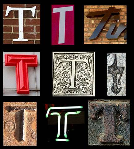 See if you recognize some bits of local landmarks above. Look familiar? The U of I entryway at Florida and Race; one of those oh-so-ugly stop signs; a long-time neighborhood restaurant; our independent movie marquis; a detail from Mt. Hope Cemetery; and even the lowly label pointing out sprinkler connections.
Every one of these signs was designed by someone — and that person had the opportunity to make it appropriate, intriguing, amusing — even beautiful. The bottom line is always readable. Too often, that just doesn’t happen. Good design requires some curiosity, a bit of historical knowledge, and a smattering of skill. Maybe this abecedarian amble will inspire you to think twice when you put up a sign in town. You could bring a smile to someone’s face every time they walk by.
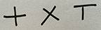 Let’s jump back to the beginning and look at “t” itself. The most basic of marks is two crossed lines:
Whether they’re straight up and down or at an angle, even today they can serve as a legal signature.
When my husband traced his grandfather to a dirt farm in rural Kentucky, his record on the 1890 census was a cross mark, with the notation “can’t read can’t write.” Maybe we’re headed back in that direction, since schools are giving up on teaching cursive. Let’s inspire kids to develop a decent signature! For the span of a lifetime, signing your name can be an expression of personal character and art.
From as long ago as 1200 BCE, the Phoenicians crossed two lines to make their letter “taw.” It meant just that, mark. These northern Semitic tribes, whom we credit with the first true alphabet, lived in the area of present-day Lebanon and Syria and traded extensively around the Mediterranean, both language and commerce. Their neighbors the Greeks, hungry for writing and power — the first historically indicates the second — helped themselves to taw, moved the crossbar to the top, and called it tau. We’ve made good use of it.
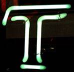 Not coincidentally, the letter taw also lent itself to the word for “tool.” The shape and style of a letterform is determined by the tool that writes it — even a tube of neon. Don’t you love this T in lights? You’ll find it in the Amstel Light sign in the window of the Esquire. Whoever designed it could have given us two straight lines. But thankfully we got an elegant swoop, with that slight swelling above the baseline. The breaks in the strokes of the letter, required by the separate tubes that contain the neon, provide a challenge that this designer solved so well.
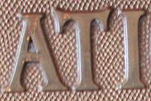 It’s useful to know something of the architecture of letterforms. Here are some in brass on the vintage cash register at The Courier. The wedges that end each “stroke” are called “serifs.” These were memorialized by a hero of mine, the calligrapher/scholar/priest Father Edward Catich, who studied early inscriptions. The Romans carved letters in stone, but they followed the outlines of hand-painted sketches. So serifs are neat ways of ending the straight lines of letters, whether they’re formed by brush or chisel.
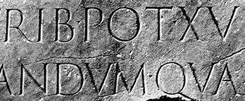
You might enjoy his 1968 classic, The Origin of the Serif: Brush Writing and Roman Letters. It’s on the shelf in the Rare Book and Manuscript Library. This is a detail of the Trajan Column in Rome, the model for Catich’s ruminations.
 The same letterforms were drawn for use today in the 1989 typeface Trajan, designed by Carol Twombly at Adobe. It’s easy to spot; it gives that classic “inscribed in stone” look.
It even does OK in lights, but really — a Roman imperial letterform for this?
Well, no type designer has control over how her work is used. Carol Twombly is one of the best. She was part of the team that Adobe assembled in the wonderful era when they masterminded the Adobe Originals. We owe great typographic thanks for these fonts, including Minion, Adobe Garamond, Lithos, Myriad, and some hundred-odd more.
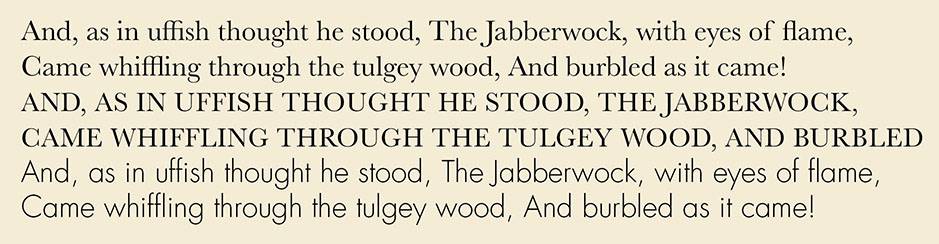
Back to serifs. They must have looked like a good idea, even when the chisel yielded to metal type and ink on paper. They’ve persisted from their origins through to digital letterforms. As a book designer I know how fierce authors can be in demanding serif type for readability on long pages. Some claim that serifs guide your eye along a line of type, helping you recognize letterforms and keep your place. The alternative, logically, if you’re French, called “sans serif,” are more geometric letterforms, with uniform line weights — none of the thicks-and-thins that are natural in letters from a brush or pen. Here’s a sample to show the difference — Jabberwocky in serif Baskerville, both lower and upper case, and sans serif Futura Light.
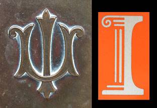
 For a closer look, the U of I sign at Florida and Race offers a convenient example of the fine points of serifs. Notice that the top left one is angled, while the right is more or less straight. This is an identifier for one of many fonts styled after Garamond, a 1540s typeface named for Claude Garamond, its French designer and punch-cutter.
Serif and sans serif are two basic distinguishers of fonts. There are many more detailed classifications; you can dig as deep as you want. The most lyrical descriptions I know are written by the Canadian poet and scholar Robert Bringhurst in The Elements of Typographic Style.
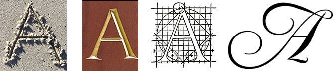
Let me confess that although we’re talking about typography, I’m taking the liberty of including handwriting. Type is the stuff of formal signage, but the integrity of a well designed letter depends on its handwritten origin. The defining shape of an A is the sketch of an ox, showing its horns emerging from the head. Here is the rough progression, which flips to the side and then upside down: first the glyph — then the Phoenician letter “aleph,” which translates as “oxhead” — to the Greek alpha — and finally our letter A. 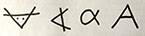
And here are descendants of those forms, rendered with stick, chisel, burin engraver, and copperplate pen:
When type goes astray, it has forgotten its origins. Would any self-respecting ox claim parentage to these?
You can go a lot farther back in the history of letters than the emperor Trajan, who died in 117 AD. Head to the Spurlock Museum and admire their collection. I’ve always enjoyed the idea of cylinder seals, round stones that can be rolled in clay or wax to leave the raised reverse of their carved patterns.
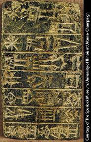
My particular favorite at the Spurlock is Sumerian red jasper from 1400-1100 BCE. This shows a prayer to the sun god Shamesh, in pictures and text.
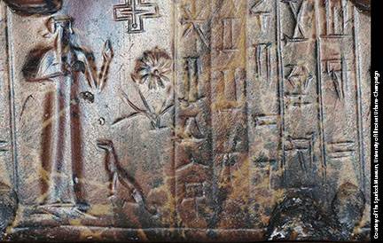
And here’s a foundation stone dating from 2200 BCE in Iraq, from the temple of Ningishzida built by King Gudea. However it came to live at the Spurlock, it’s an astounding artifact to have right here, right now.
You can see more inspiring originals in town, not in stone but on vellum — the real stuff is animal skin. Treat yourself to a visit to our Rare Book and Manuscript Library on the 3rd floor of the main library at the U of I.
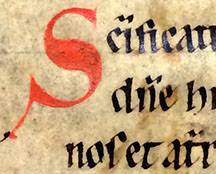
Recently on view was this delightful flourish in pen and ink from 14th century Italy.
To bring typographic history up to the cutting edges of cyberspace, you can navigate on your own laptop into the world of unicode. Some group of great minds continues to design a character for every symbol — alphabetic and otherwise — you might encounter. If you’re looking for that particular diacritic in Icelandic or want to encode a secret message to your sweetie in original Phoenician, you can do it in unicode.
 Let’s tear ourselves away from academics to a bit more local scenery. One December day I enjoyed a fine piece of brush lettering, a rare skill these days. We have the real thing, alive and well in the window of Merry Ann’s Diner in Urbana, handpainted by owner Tony Pomonis’s sister.
And how totally charming to happen upon this sign in the window of the Bread Company, a holiday message to their patrons.
Grocery stores in particular used to hire professional sign painters. Do you remember those handlettered signs for vegetables and specials? Many were beautiful, painted with lush tempera and a long-haired flexible brush that could be shaped to just the right width for each letter.
You can admire these endangered skills in a remarkable film, shown a while back at Parkland, Sign Painters: The Movie.
 Every office in town was originally labeled by hand. I found this example in Davenport Hall on the quad. The J and R are particularly exquisite; do you suppose it was a John or a Roberta who painted it?
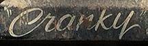
The proud owner of a big hunk of vehicular metal can still can hire a pinstriper to decorate the heck out of it. This is an art with an underground mystique a bit like tattooing. Here’s a sweet nickname rolling around on a dump truck in town.
Who needs digital billboards when we have art all around us, sitting still to be admired? Enjoy this bit of local history: on the left the gorgeous 1890s brasswork on the door of Altgeld Hall. When some ambitious marketers thought the university needed a spiffy new brand, campus designers did backflips to please the Board of Trustees. The winner, by Jason Lindsey, is thankfully a dignified and classic mark that looks good in many contexts.
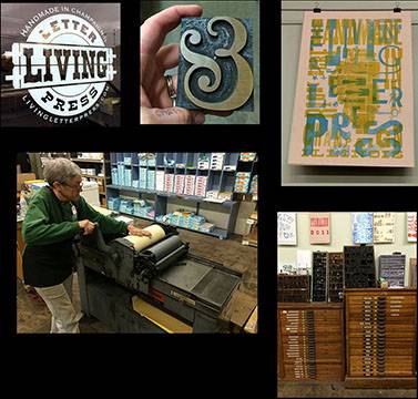 A great place to literally hold and feel some solid letterforms is a rare resource in town. Tucked at the back of Dixon Graphics on John Street between Neil and Randolph you can find the Living Letterpress, John Bonadies’ salute to the real thing in wood and metal. Take one of his workshops to try your hand at designing a one-of-a-kind card.
It’s a rare opportunity to pick up a composing stick and ink up 3-dimensional letters on a Vandercook SP-20. Or commission John to make a poster, cards, coasters, or whatever your fancy concocts.
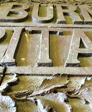
Some of the town’s history is best remembered in its signs. The original terracotta for Burnham Hospital is preserved in all its gigantic glory at PACA, the Preservation and Conservation Association. I went there the other day to admire it in person. Here’s a T for you, at the angle you would have seen it on the side of the building. There are lovely terracotta pieces scattered around the U of I campus, notably in Lincoln Hall, where their history is well recorded, and outside the Ceramics Building on South Goodwin. Word has it that there is still an artisan on staff at the university who is savvy in the art and restoration of terracotta.
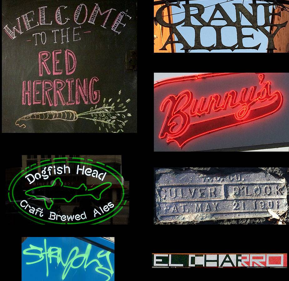
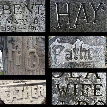
I can’t resist sharing a few last favorites. Lunch at the Red Herring is richer thanks to the menus by Caitlin Mackey, recent graduate from the U of I. There’s even some decent graffiti around town — I like this bit from a dumpster near Caffe Bene in Urbana. Or give yourself a restful walk through Mt. Hope cemetery just north of Florida. Drop me a line if you want to share your finds — or take an abecedarian stroll in person.
If you’re a book person, always one after my own heart, a recent romp is Just My Type. You might find yourself H for Hooked.
Cope Cumpston is a typographer, book designer, and community enthusiast resident in Urbana. You can reach her here: ([email protected]). The archive of abecedarian C-U lives here.