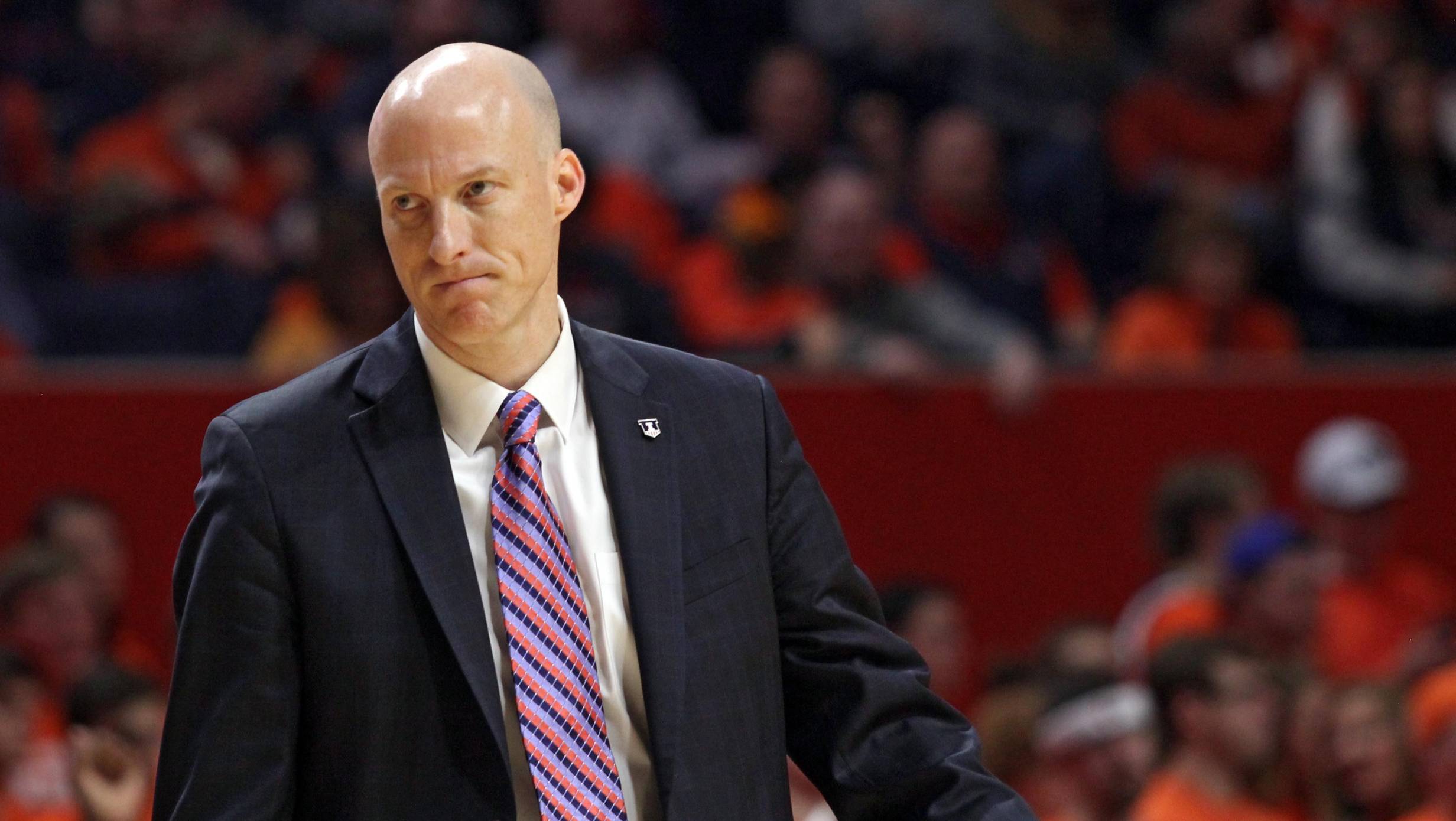
Illinois played a basketball game Saturday against Penn State. Illinois lost 83-70. Except for a 14-0 run in the second half that brought Illinois kinda, maybe, not really close to tying the game, it was a sloppy, not-very-entertaining one to watch. As both teams have losing conference records (Illinois 4-9, PSU 6-7), the game has really no impact on who wins the Big Ten this year, or much of anything else.
Details of the game have been dutifully described by other Illini scribes elsewhere, but will eventually become ignored footnotes in history until Illinois has another 3-game losing streak to Penn State (this is only the team’s second such streak). Thus, I don’t see much point in writing about a fairly boring and rote (unfortunately for those who had high expectations for the Illini this year) game. Instead I’ll focus on something that wasn’t boring: the jerseys.
Despite lacking luster in terms of basketball, the jerseys on the court Saturday really popped. Illinois went with their orange set and Penn State with solid blue unis. It goes without saying that an orange vs. blue matchup at State Farm Center looks nice. But Illinois could look even better.
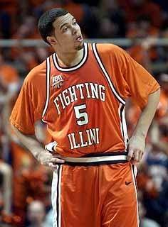 Since Illinois “rebranded” in 2014, the team has worn orange, white, blue, and silver jerseys with the signature “Illinois” font on the front and a rounded-off zig-zag traversing the sides. These jerseys are fine. In some ways they’re better than what came before (the addition of the silver jersey, in particular), and in some ways they’re worse (I liked the duotone, sans serif “Illini” more than the signature font, and the sublimated Foellinger on the back no longer has much appeal). The best part about Illinois’s jerseys this season, though, is how often they’ve worn the “Fighting Illini” throwback uniform.
The “Fighting Illini” set is maybe the best jersey in school history. Some of that has to do with the association to the ‘89 Flyin’ Illini that made the Final Four, but no one’s really clamoring to bring back the 2005 jersey (maybe because that team also looked best when wearing the ‘89 jersey, pictured). It would be great if Illinois made the Fighting Illini jerseys a primary set, but what other looks could the team use? Looking back is good place to find some ideas, because if Nebrasketball can get a few throwbacks a year, Illinois certainly should, too. So, here’s the top five jerseys I’d like to see Illinois wear on the court.
5. 1980-93 “Fighting Illini” jersey
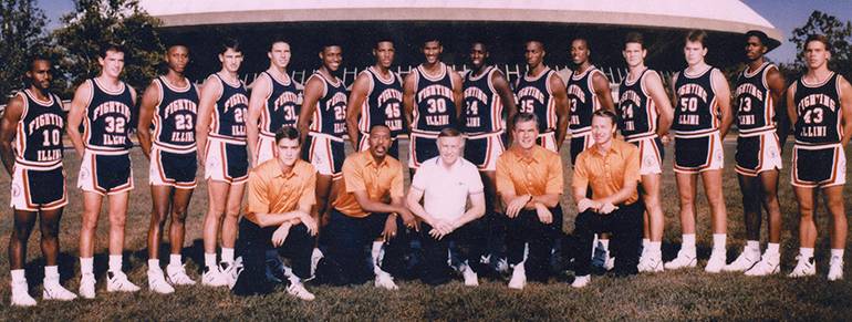
Nothing particularly noteworthy about this year, other than it being Nick Weatherspoon’s senior year, but this jersey is pretty nice. It reminds me of the classic Michigan set, which Jordan brand was wise to return to. It’s all clean lines and whitespace, hitting that mid-century modern sweetspot. If Nike were to return to something clean like this as a primary look, that wouldn’t be bad either.
4. 1973 Illini jersey
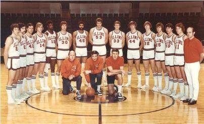
Nothing particularly noteworthy about this year, other than it being Nick Weatherspoon’s senior year, but this jersey is pretty nice. It reminds me of the classic Michigan set, which Jordan brand was wise to return to. It’s all clean lines and whitespace, hitting that mid-century modern sweetspot. If Nike were to return to something clean like this as a primary look, that wouldn’t be bad either.
3. 1953-54 Illinois jersey
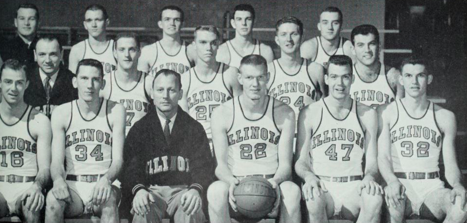
Using Michigan State’s “Michigan Agricultural College” uni as an inspiration, Illinois should rock this look and throw it way, way back. There’s a lot happening here, but it’s all great. First the I with Bs on either side (presumably for “basketball”), this logo is totally different than what we see today. Second, the contrasting blue top-white bottoms is a look no one else is doing and could look very nice if done correctly. There’s so much potential for a fun uniform set here, it would be really cool to see it done.
2. 1910 “IBB” jersey
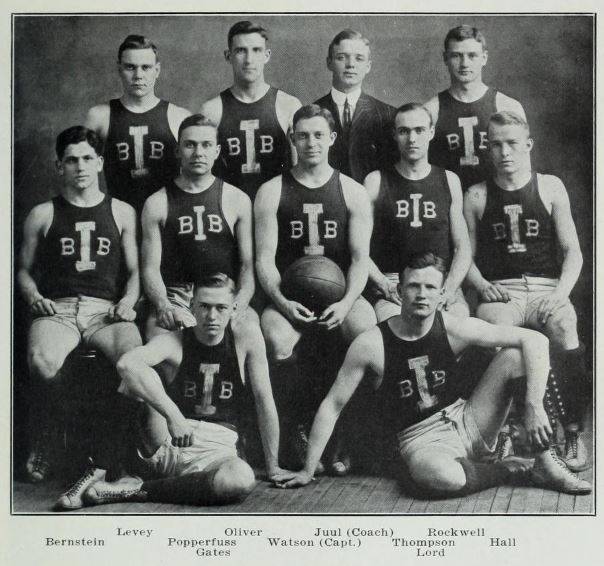
Using MSU as an inspiration again, rock this look and throw it way, way back. There’s a lot happening here, but it’s all great. First the I with Bs on either side (presumably for “basketball”), this logo is just screaming out for a reissue. Second, the contrasting blue top-white bottoms is a look no one else is doing and could look very nice if done correctly. There’s so much potential for a fun uniform set here, it would be really cool to see it done.
1. 1975 Script Illinois jersey
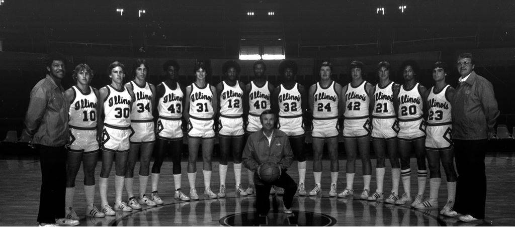
Kick it back to Lou Henson’s first year with the team and maybe my favorite of all the Illinois jerseys. The script is the star here, and it is a beaut, much like Michigan State’s “State” script. Illinois is foolish for not returning to this, honestly. Look at it. But the other details on this jersey are also great. That Block I in a diamond on the shorts? That’s snazzy, man. Nike is messing up if they don’t pull this one out soon.
I mean, at least something should look good on the floor. Right?
[gallery ilpsu021117]


